As I've been planning for my upcoming Project Term classes this June, I've been looking through Art21's exclusives videos for inspiration. Season 6 is premiering in April, so there are several "preview" clips for the upcoming season. I came across this one from artist David Altjmed. Like him, I am drawn to pastel colors, but sometimes in combination they look baby-ish or Easter-ish. Too cutesy. I like that he "infects the prettiness" of the pastels with grays and browns. It reminds me of my macabre class that I'm designing called "Why We're Drawn to the Darkness...", where we'll explore themes of lightness vs. darkness, attraction vs. repulsion, beauty vs. the grotesque, etc.
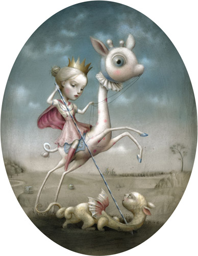
One of the art books I bought to help me plan for the class is Art that Creeps: Gothic Fantasies and the Macabre in Contemporary Art, and one of its featured artists in Nicoletta Ceccoli. Her work uses pastels, and she too "infects the prettiness" with both darker, duller colors and darker content and themes. Her work below, The Princess and the Prey, seems at first whimsical, sweet, something out of a fairytale....adorable, even. But the girl rider doesn't seem innocent. She seems sad, certain, poised. And her steed looks alarmed. The beast she is slaying too human, too calm. Dice scattered in the background. Grays and dusty blues and greens smudging the pretty pastels. And yet I like the work more because it's not so predictable, so Disney, so cutesy. She looks like a serious heroine, and a smart one, and one who knows the woes of the world.
One of the art books I bought to help me plan for the class is Art that Creeps: Gothic Fantasies and the Macabre in Contemporary Art, and one of its featured artists in Nicoletta Ceccoli. Her work uses pastels, and she too "infects the prettiness" with both darker, duller colors and darker content and themes. Her work below, The Princess and the Prey, seems at first whimsical, sweet, something out of a fairytale....adorable, even. But the girl rider doesn't seem innocent. She seems sad, certain, poised. And her steed looks alarmed. The beast she is slaying too human, too calm. Dice scattered in the background. Grays and dusty blues and greens smudging the pretty pastels. And yet I like the work more because it's not so predictable, so Disney, so cutesy. She looks like a serious heroine, and a smart one, and one who knows the woes of the world.
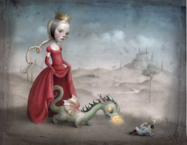
The Princess and the Prey is from the book I purchased, so I've spent some time studying it over the past few weeks. But as I was looking at Ceccoli's website, I saw many other interesting pieces from her portfolio. The one I'm posting below, Contrary Mary, triggered a giggle when I first looked at it. I love the toughness of the girl, pulling up her skirt, and then the surprise that it's not her lady parts that she's showing off to the boy, but a dragon. Like she's saying, "don't mess with me, little man." And he is, literally. She seems condescending, maybe. That she pities how stupid the boy is for approaching her or for trying to woo her or for trying to violate her. Again, the same silent, knowing look. Not angry. Not afraid. Just aware. And self-assured.
 RSS Feed
